
Recent

Visualisation of the admission quota of NUOL
·441 words·3 mins
Creating a 3D topographic map with Blender
·1133 words·6 mins
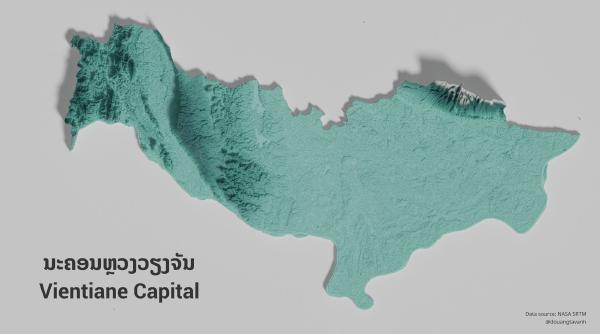
Lao topographic maps
·174 words·1 min
NOTE: Ask Questions to Make Data-Driven Desions
·357 words·2 mins
NOTE: Prepare Data for Exploration
·277 words·2 mins